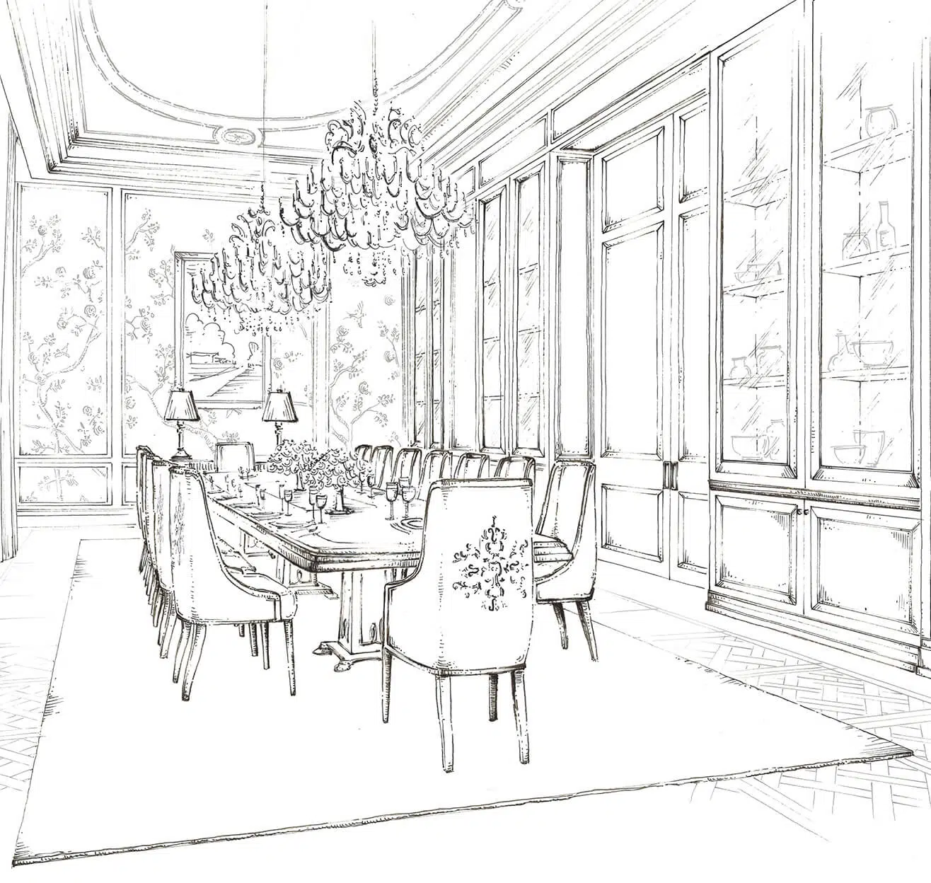

A personal passion of mine is the inclusion of hand sketches in the overall design process. I find it an incredibly important step when formulating a design, proving to be a particularly powerful tool to illustrate the overall vision to the client in an attractive and informative way. My team of interior architects and designers have been selected for their broad experience, passion and their technical skills., including sketching, something which I always look for when selecting new team members. While some clients prefer CGIs, especially in the commercial interior design and hospitality sector, I always find that for private residential design, sketching is the best., adding a charming and personalised touch to enhance the client’s experience.
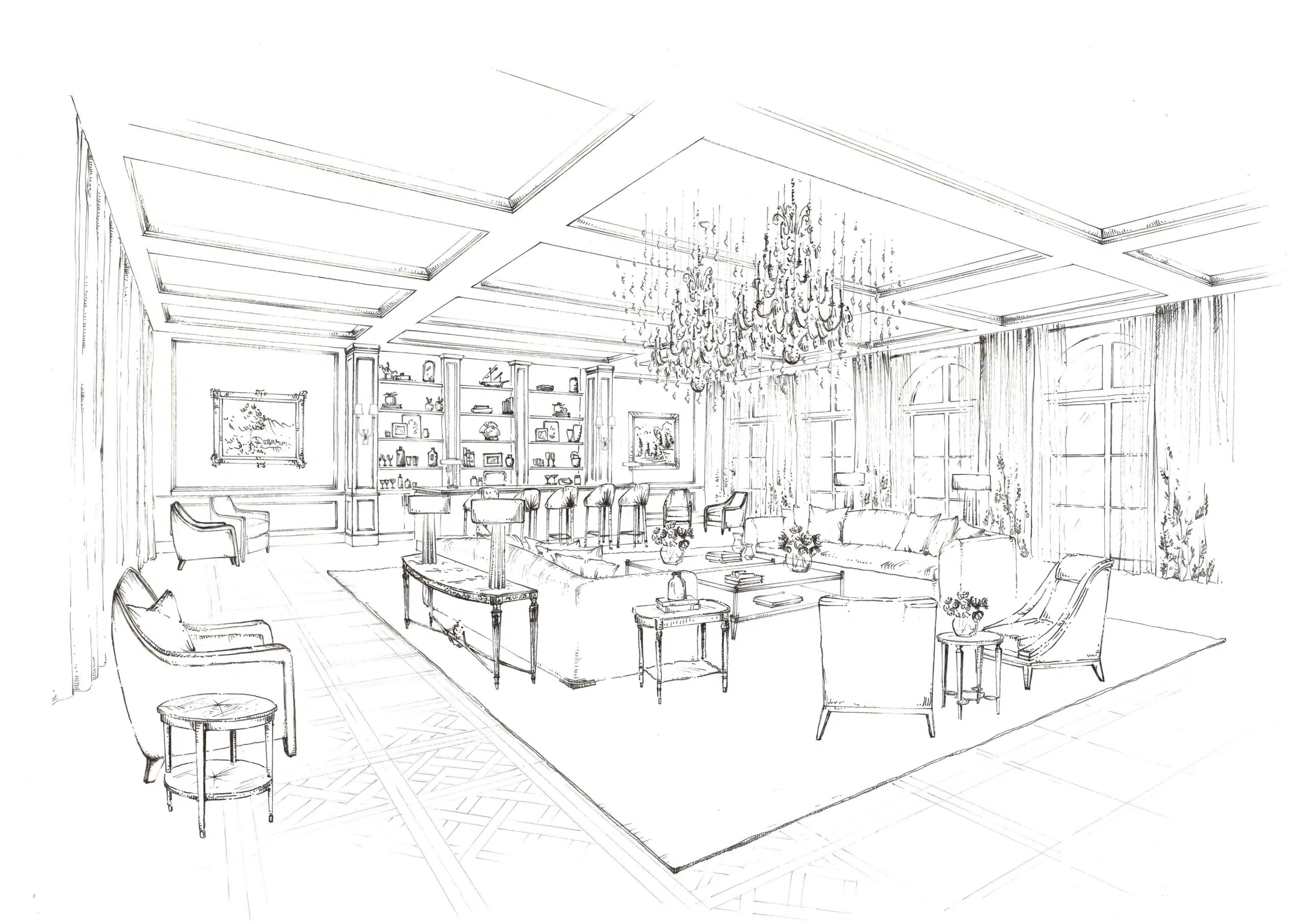
This sketch shows the Ballroom from our South of France interior design project. The graceful proportions of the room and the symmetry of the space, especially the arched windows, lends itself beautifully to sketching. Here, my wonderful interior architect has paid attention to certain key details that are critical to the balance of the overall design. The embroidery to the curtains is one, the cluster of chandeliers is another. One important, yet perhaps surprisingly effective technique, is not to show too much detail; it can crowd and overwhelm the viewer. I find the best sketches are loose and impressionistic, for example, in this sketch, only a small section of the Parquet de Versailles flooring is shown in detail – a simple suggestion is just enough.
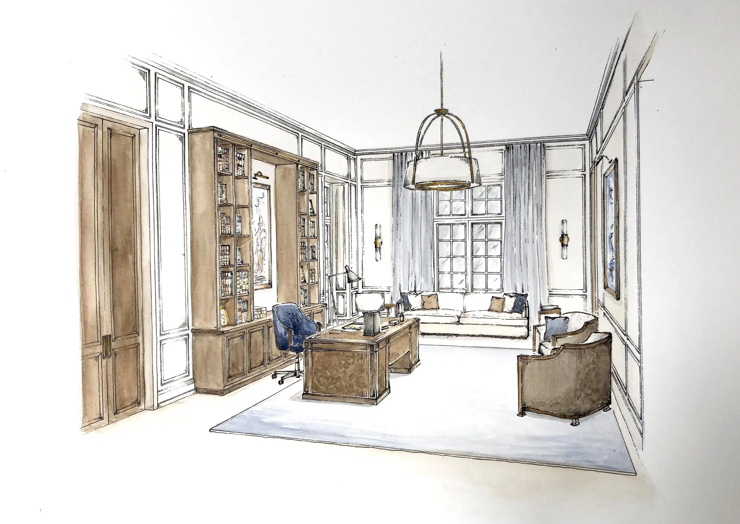
The rooms that work particularly well in sketch form are invariably those with strong, linear, joinery pieces; typically games rooms, studies, dressing rooms and libraries. Partly because they can be drawn up in 3D to give proportional bare bones, over which a sketch can then be placed, but also because the clarity of a sketch really suits the clean graphic lines of intricate joinery. For this study, a light watercolor wash helps to pick out the show-wood finishes to the bookcase and desk, whilst illustrating how this is balanced by the finish of the attractive, curved, armchairs. Some clients love the addition of watercolour pigment, whilst others find it distracting. I tend to present black and white sketches at conceptual development stage and only add washes of colour once the fabrics and finishes are being discussed in detail with the clients to help them understand the overall design scheme.
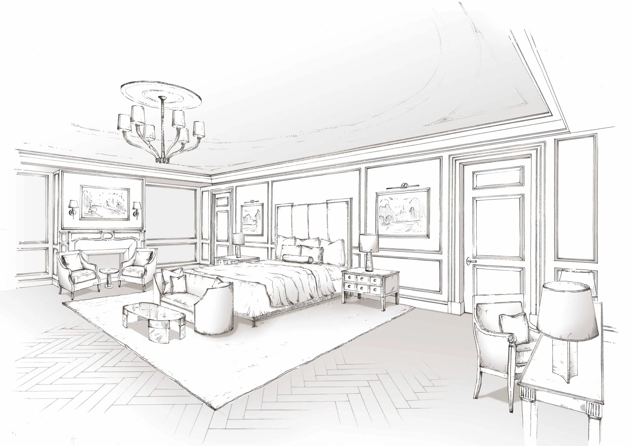
Bedrooms are really well suited to the sketching medium, as CGIs and rendered elevations, although a valuable design tool, never quite capture the atmosphere, soft drapes and textures of fabrics at the heart of bedroom designs. A sketch is the perfect way to illustrate overlapping bed cushions, throws, window treatments and soft, gathered lamps shades. Light shading can be added after, to create a sense of depth and layering; something which can be achieved effectively in Photoshop, working over the original sketch to allow it to evolve, without muddying the original vision.
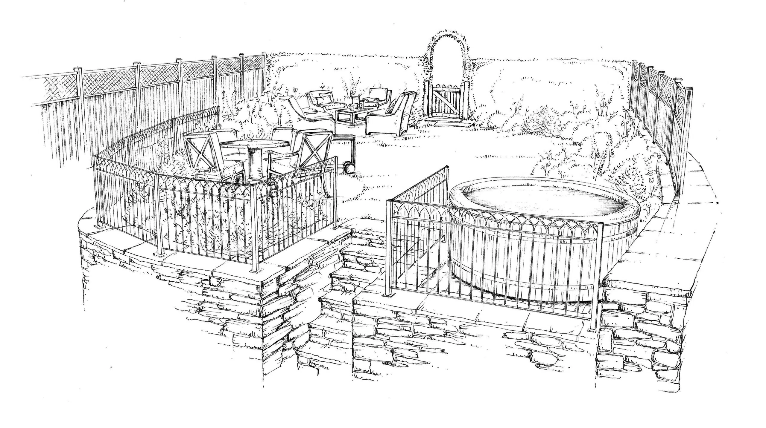
Last of all, I love using sketches to bring together a landscape or garden design. It helps to capture the soft organic growth that will overlay the hard structure of a new garden. This sketch shows how a sketch can bring together many different elements and clearly shows how they will work together. So helpful for both the client and for my team, our designs are always evolving and sketching helps us to really think through a space and conceive it from every angle, to ensure every detail is just right.


