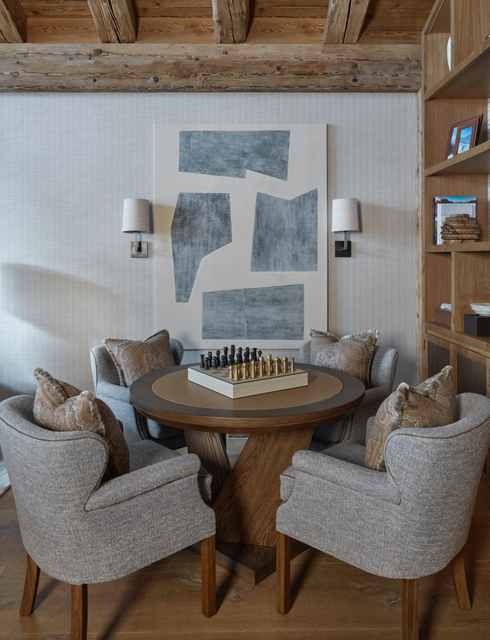
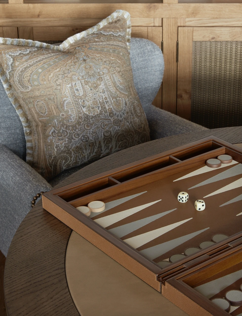
Colour custodians Pantone have announced their ‘Colour of the Year’ for 2025 with the warming, rich neutral hue Mocha Mousse (17-1230) being selected for the lauded position. Both humble and luxurious, this versatile shade is something I have used across many of my designs for a calm and comforting feel. In a recent Alpine chalet design, we created a soft mocha hue across all the timber finishes and added accents of this beautiful colour in pretty paisley cushions from De Le Cuona, pairing them with some leather accessories from my boutique’s collection.
AS A BASE COLOUR
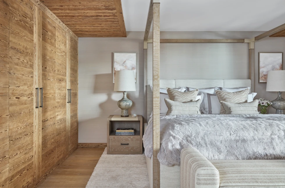
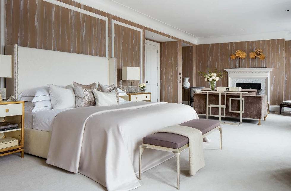
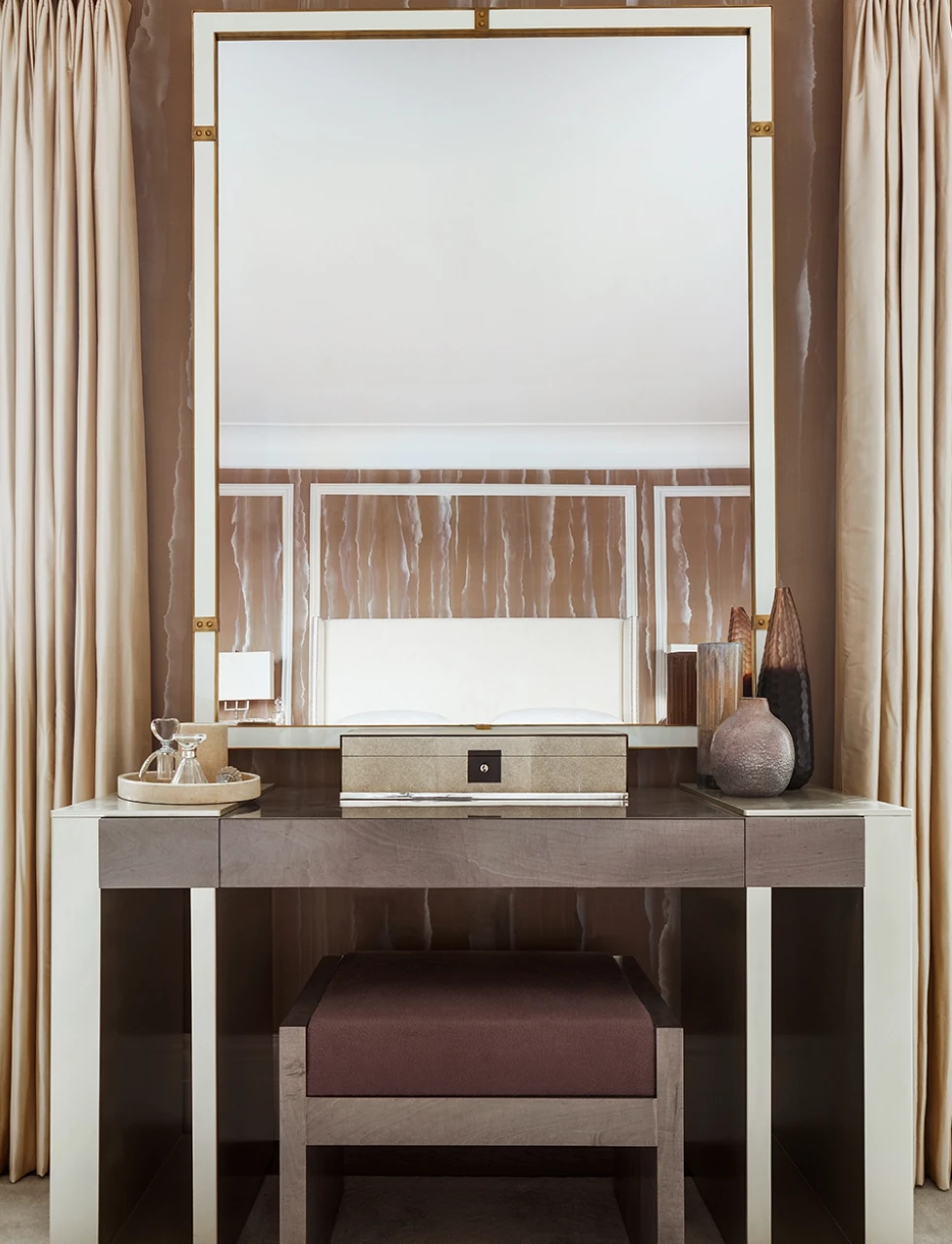
Mocha Mousse is a mood. It is versatile enough to blend seamlessly into neutral palettes while standing confidently as a statement shade. I chose a similar hue for the silk wallpaper of this Primary Bedroom in our St. James’ project in London. As a base colour it provided an earthy and grounding backdrop for a peaceful space. I paired it with complimentary hues of soft ivory and light lavender-grey, as well as natural textures like the rock crystal table lamps, to keep the room fresh and peaceful.
AS AN ACCENT
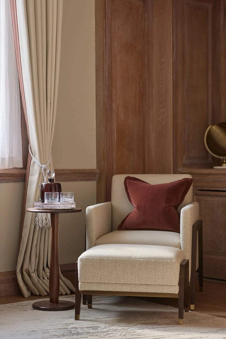
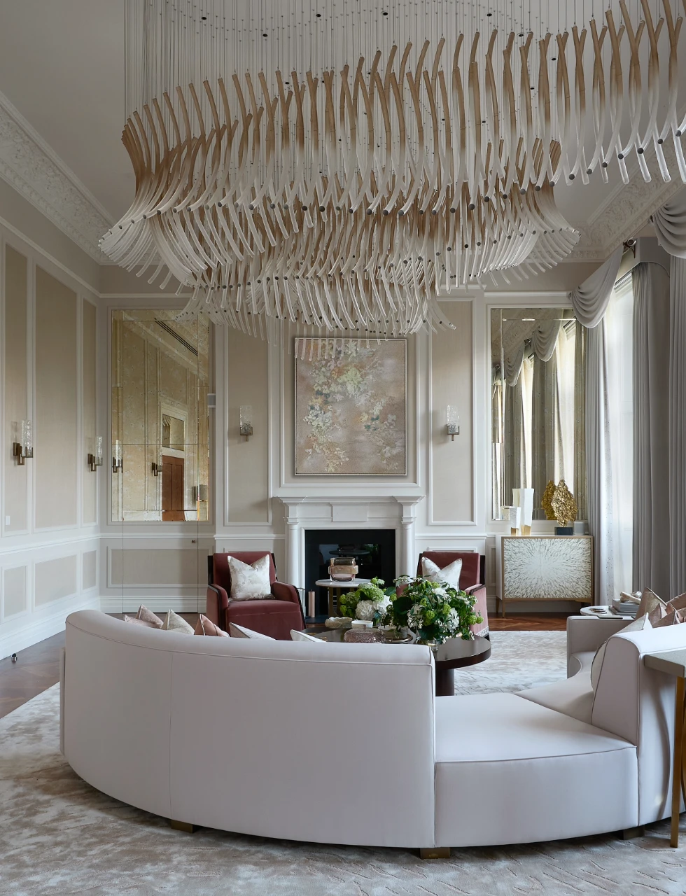
Its velvety brown tone is accented with gentle pink undertones that adds a sensual and inviting dimension, perfect for living spaces. The pink notes enrich its warmth, giving it an elegant edge and enabling it to delicately compliment other shades. Comforting and dignified, Mocha Mousse is not so far removed from the creamy neutrals we’ve witnessed dominating the interior design industry in the past few years. Pictured below is one of our most popular designs, the living room at our Hyde Park project. You can see soft tones offset the bold shapes of the bespoke chandelier and vintage chevron floorboards. Mocha Mousse is nestled in the smaller accents, offsetting the vibrancy of other features in the room, balancing a diverse grouping of tones across warm and cool.
IN ACCESSORIES
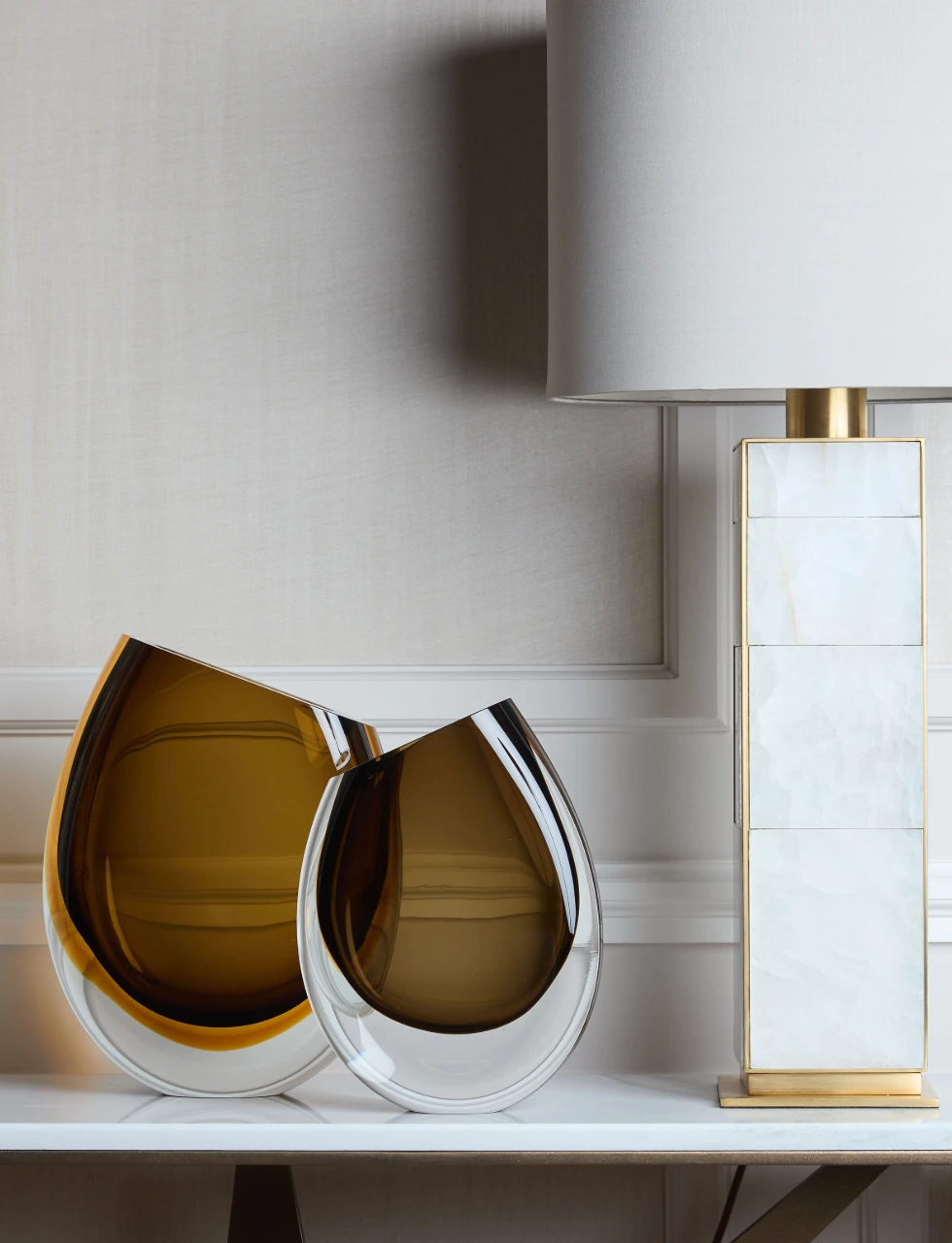
Mocha Mousse exemplifies the aesthetics of simplicity and essence of luxury. Its presence invites us to savour the small joys, celebrating the simple yet profound connections we find throughout our daily lives. In accessories or in accents across a room, the colour adds dimension and impact. Pictured below is a pair of our Orla Vases in rich mocha tones. Beautifully handcrafted, the glass accessories infuse a sensorial, sophisticated warmth ideal for an entryway.
IN ARCHITECTURAL FINISHES
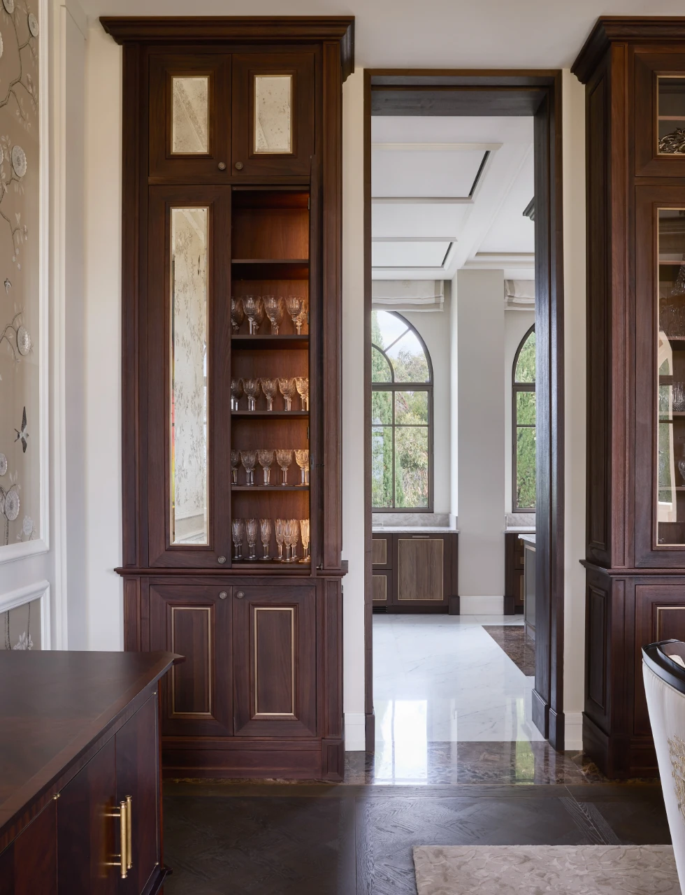
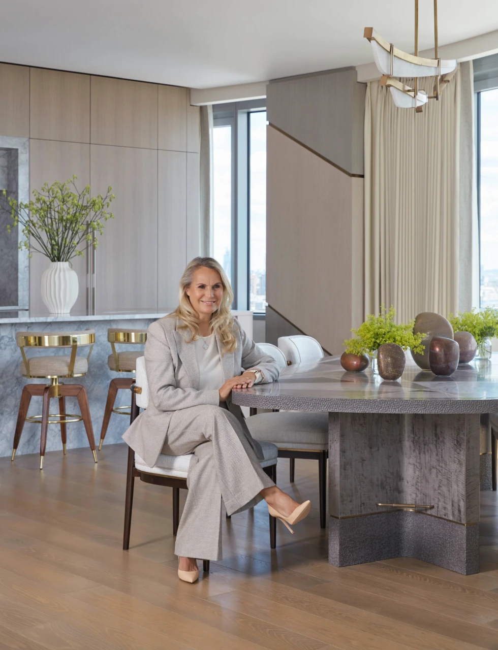
The shade is an evocative rich brown infused with opulent warmth. Whether it appears on flooring, wall panelling, joinery or doors and architraves, it is well suited as a colour for interior architecture finishes. In our Marble Arch project we used it on the veneered cabinetry in the kitchen, the floor and the dining table finishes. It paired perfectly with the commissioned pieces from West Australian ceramic artist Pippin Drysdale.
Ultimately, luxury means exceptional comfort and ease, its form is dynamic to each individual’s personal preference. This is what my clients want in their home, and what they look to me for realising in their design. The earthy colour reflects humanity’s growing efforts to better align ourselves with the natural world and return to an appreciation of the simple things in a world increasing in complexity.
